


Styleguide
H1 for desktop
- Create a container and rename it ‘[Number] Desktop – H1’.
- Open the settings for this container. Here, the stage design is created under the ‘Background’ tab under ‘Image’ and the following settings are specified
- General
-
- Interieur content width: Site Width
- Height: Minimum height
-
- Minimum height: 730
-
- Container visibility: hide Small Screen
-
- Design
- Special settings for desktop:
- Top margin: 0px
- Top margin: 0px
- Top padding: 170 px
- Special settings for tablet:
- Top padding: 230 px
- Right and left padding: 10%
- Container border size to the right and left: 32 px each
- Container border color: White
- Special settings for desktop:
- Background
- Background options – Colour
- Container background colour: rgba(0,0,0,0.71)
- Background options – gradient
- Gradient start colour: rgba(128,128,124,0)
- Gradient end colour: rgba(0,0,0,0.25)
- Gradient start position: 38
- Gradient angle: 239
- Background options – image
- Select the appropriate image
- Background size: Cover
- Background options – Colour
- General
- Save and close
- A column is created in the container and a ‘Title’ is created within the column
- Column settings
- Margin: 0px everywhere
- Settings for the ‘Title’ module under Design
- HTML heading tag: H1
- Typography: Level 1
- Font Color: White
- Column settings
H1 for mobil
- Create a container and rename it ‘[Number] Mobile – H1 + Intro’.
- In the settings for this container, set ‘Container Visibility’ to ‘Small Screen’.
- Create a column in this container and add the ‘Image’ module to this column.
- Select the appropriate stage design for mobile devices under the ‘Background’ tab.
- The ‘Image’ module is followed by a ‘Separator’ with the following settings:
- General
- Style: No Style
- Design
- Top margin: 40 px
- General
- Create a new column below and insert the ‘Title’ module, into which the heading will be placed. The font settings under Design are as follows:
- HTML Heading Tag: H1
- Typography: Level 1
- Font Color: Black
- Below this, insert a new column with the following settings:
- General:
- Content Layout: Row
- Content Alignment: Center
- Design:
- Left and right padding: 37 px
- General:
- Insert the ‘Text Block’ module into the column for the intro. Under “Design” in the Typography section, set the text to ‘Body’.
- Create a container
- A column is created in this container and the ‘Title’ module is inserted into this column. The following settings apply to the ‘Title’:
- Design
- HTML Heading Tag: H2
- Typography: Level 2
- Design
- This is followed by three ‘1/3 Nested Columns’. Each row has a ‘margin’ of 40 px at the bottom on mobile devices
- Each row begins with an ‘Image’ and these have a ‘Margin’ of 30 px at the bottom on mobile devices
- The image is followed by a ‘Title’ in each row, with the following settings:
- HTML Heading Tag: H3
- Typography: Level 3
- Mobile margin to the left: 0 px
- The ‘title’ is followed by two ‘text blocks’ per column and one ‘button’ each, which leads to the target page
- For the ‘text block’ and ‘button’ modules, the typography is set to “body” under ‘design’
Example: Product teaser

Treppenlift S200
Sitzlift für kurvige Treppen
Der Treppenlift für kurvige Treppen wird für Ihren Treppenverlauf maßgeschneidert und überwindet so gut wie alle Treppenformen und -verläufe – auch enge, schmale oder Wendeltreppen.
Der Sitzlift S200 ist individuell konfigurierbar und fügt sich somit harmonisch in Ihr Wohnumfeld.

Treppenlift S100
Treppenlift für gerade Treppen
Die klassische Wahl ist der Treppenlift für gerade Innentreppen. Aufgrund seiner geradlinigen Struktur ist er in Planung und Installation sehr einfach. Der S100 Treppenlift wurde sorgfältig entworfen, um Ihren individuellen Anforderungen gerecht zu werden, und integriert modernste Technologie sowie höchsten Komfort.

Treppenlift S100 Outdoor
Outdoor – für jedes Wetter
Für diejenigen, die einen Treppenlift für den Außenbereich benötigen, bieten wir den S100 Outdoor. Unser im Freien installierter Treppenlift muss naturgemäß verschiedenen Witterungsbedingungen standhalten können. Dafür sorgt ein wasserdichtes und isoliertes Gehäuse. Entdecken Sie unseren Premium-Außenlift!
Brochure desktop
- Create a container and within this container a ‘1/3 – 2/3 Nested Column’ and give the container the following settings:
- General:
- Interior Content Width: Site Width
- Column Justification: Flex End
- Column Spacing: 1 %
- CSS ID: custom-info-block-gradient
- Design:
- Margin: 50px (both)
- Padding top and bottom: 64px
- Container Link Colour: Purple
- Background:
- Container Background Colour: #E9E9E9
- General:
- The image of the brochure is created in the first third. To do this, use an ‘Image’ with the following settings
- 1/3 Nested Column
- General:
- Alignment: Flex End
- Content Alignment: Space Evenly
- Absolute Offset Up: -155px
- General:
- Image
- Design:
- Image Max Width: 340px
- Alignment: Left
- Design:
- 1/3 Nested Column
- A ‘Title’ is inserted into the second third, as well as a ‘Text Block’ and a ‘Button’.
- The column is given the following settings:
- General:
- Content Alignment: Center
- General:
- Settings for the ‚Title‘
- Design:
- HTML Heading Tag: H2
- Typography: Level 3
- Font Color: White
- Design:
- In the ‘Text Block’, the ‘Typography’ is set to “Body” and the ‘Font Colour’ to ‘White’.
- The ‘Button’ is given the following settings:
- Design:
- Button Style: Custom
- Gradient Start Colour: rgba(242,108,8,0)
- Gradient End Colour: rgba(242,108,8,0)
- Gradient End Position: 100
- Gradient Angle: 180
- Button Text Colour: White
- Button Border Size: 2 (überall)
- Button Border Colour: White
- Button Size: Custom
- Padding at top: 12px
- Padding at right: 48px
- Padding at bottom: 11px
- Padding at left: 48 px
- Typography: Body
- Design:
- The ‘1/2 Column’ is followed by a ‘1/1 Column’. A CSS code is integrated into the column [copy CSS code from the example].
- This is followed by the integration of a ‘modal’.
- Name of modal: Add the appropriate name, e.g. request_brochure_straight_stairs_mobile
- Contents of modal: [Copy HTML code from the example]
Example: Brochure for desktop

Brochure mobil
- Create a container and a 1/3 – 2/3 nested column within this container. The container will have the following settings:
- General:
- Interior Content Width: Site Width
- Column Alignment: Flex End
- Column Justification: Flex End
- Column Spacing: 1 %
- Container Visibility: Small Screen
- CSS ID: custom-info-block-gradient
- Design:
- Margin top: 140px
- Padding top: 196px
- Padding bottom: 40px
- Background:
- Container Background Colour: #E9E9E9
- General:
- The image of the brochure is placed in the first third using an ‘Image’ with the following settings
- 1/3 Nested Column
- General:
- Alignment: Flex start
- Content Layout: Row
- Content Alignment: Center
- Design:
- Margin top: -155px
- Margin bottom: 0px
- Extras:
- Absolute Offset: -150px
- General:
- Image
- Design:
- Image Max Width: 250px
- Alignment: Left
- Design:
- 1/3 Nested Column
- A ‘Title’ is inserted into the second third, as well as a ‘Text Block’ and a ‘Button’.
- The column is given the following settings:
- General:
- Content Alignment: Center
- General:
- Settings for the Title
- Design:
- HTML Heading Tag: H2
- Typography: Level 3
- Font Colour: White
- Design:
- In the ‘Text Block’, set the typography to Body and the font colour to White.
- The button has the following settings:
- Design:
- Button Style: Custom
- Gradient Start Colour: rgba(242,108,8,0)
- Gradient End Colour: rgba(242,108,8,0)
- Gradient End Position: 100
- Gradient Angle: 180
- Button Text Colour: White
- Button Border Size: 2 (überall)
- Button Border Colour: White
- Button Size: Custom
- Padding at top: 10px
- Padding at right: 30px
- Padding at bottom: 9px
- Padding at left: 30px
- Typography: Body
- Design:
- The 1/2 column is followed by a 1/1 column with the following settings:
- A code block with the following lines is entered into the column:
- This is followed by the integration of a modal
- Name Of Modal: Add the appropriate name, e.g. request_brochure_straight_stairs_mobile
- Contents of Modal: [Copy HTML code from the example]
Example is visible on mobile devices
Example: Brochure mobil
- Create a container and, within this container, a column with the ‘Title’ module.
- Set the text for the heading in the ‘Title’ and assign the following settings
- Design:
- HTML Heading Tag: H2
- Typography: Level 2
- Design:
- Insert another column below the ‘Title’ and add the ‘Post Cards’ module to this column.
- The settings for the column are as follows:
- Design:
- Column Spacing: 0%
- Margin: 0px
- Padding at top and bottom: 0px
- Padding to the left: 38px
- Design:
- Settings for the ‘Post Cards’ module
- General:
- Post Type: Posts
- Posts By: Categories
- Post Status: Published
- Include Kategorien: Benefits
- Exclude Kategorien: Categories
- Number of Posts: 5
- Order By: Menu Order
- CSS ID: custom-postcart-gradient-border
- Design:
- Layout: Carousel
- Number of Columns: 3
- Transition Speed: 500
- Show Navigation: Arrows
- Margin nach oben: 0px
- Margin nach unten: -40px
- General:
- The ‘Code Block’ module follows the ‘Post Cards’ module; the corresponding code can be copied from the example.
Example: Advantage teaser
FAQs
- Create a container and insert two columns there
- The first column is for the ‚Title‘, if one is needed
- The second column is for the “FAQ” module, which has the following settings
- General:
- Display Filters: Hide
- Number Of FAQ Posts: Individual number of FAQs, e.g., 5
- Post Status: Published
- Categories: Enter the name of the FAQs, e.g., FAQ Movement Games
- Order: Ascending
- Design:
- Divider Line Color: #E9E9E9
- Toggle Padding Right and Left: 10px
- Title Tag: H3
- Title Typography: Body
- Icon Size: 24
- Icon Colour: Purple
- Icon Boxed Mode: No
- Icon Alignment: Right
- Content Typography: Body
- FAQ Toggle Hover Accent Colour: #A31AFF
- FAQ Toggle Active Accent Colour: Purple
- General:
Example: FAQs
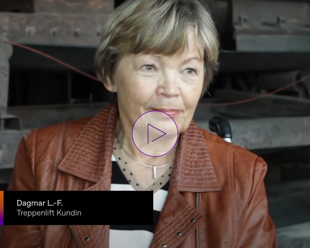
Customer testimonial desktop
- Create a container with the following settings:
- General:
- Column Spacing: 0px
- Design:
- Padding to bottom: 64px
- Background:
- Container Background Colour: Orange
- General:
- A ‘1/2 Nested Column’ is inserted into the container, with the ‚Lightbox‘ module on the left-hand side and the ‘Text Block’ module on the right-hand side.
- The left column has the following settings
- General:
- CSS ID: custom-image-fullsize
- Background:
- Background Colour: Black
- General:
- The ‘Lightbox’ module has the following settings
Thumbnail- Image:
- Select the appropriate image
- Content Type: Video
- Video URL: Enter the appropriate URL
- The right-hand column has the following settings
- General:
-
- Alignment: Stretch
- Content Alignment: Center
-
- Design:
- Padding to the right and left: 60px
- Background:
- Background Colour: Orange
- Image:
- The following code is integrated into the ‘Text Block’ module on the right-hand side before the name: see example
- Design:
- Margin bottom: 30px
- Typography: Body
- Font Colour: White
- Design:
- This column contains another ‘Text Block’ for the quotation with the following settings:
- Design:
- Margin buttom: 30px
- Typography: Body
- Font Color: White
- Design:
- After the two ‘Text Blocks’, insert the ‘Button’ module with the following settings
- General:
- Button URL: Add the corresponding URL
- Button Text: Add appropriate text
- Design:
- Typography: Body
- Button Span: Standard
- General:
Customer testimonials mobil
- Create a container with the following settings:
- General:
- Column Spacing: 0px
- Design:
- Padding to the bottom: 64px
- Background:
- Container Background Colour: Orange
- General:
- A ‘1/2 Nested Column’ is inserted into the container, with the “Lightbox” module on the left-hand side and the ‘Text Block’ module on the right-hand side.
- The left column has the following settings
- General:
- CSS ID: custom-image-fullsize
- General:
- The ‘Lightbox’ module has the following settings
- Thumbnail Image: Select the appropriate image
- Content Type: Video
- Video URL: Enter the appropriate URL
- The right-hand column has the following settings
- General:
- Alignment: Stretch
- Content Alignment: Flex Start
- Design:
- Margin to the top: 0px
- Padding to the top and bottom: 40px
- Padding to the right and left: 20px
- Background:
- Background Colour: Orange
- General:
- The following code is integrated into the ‘Text Block’ module on the right-hand side before the name: see example
- Design:
- Typography: Body
- Font Color: White
- Design:
- This column contains another ‘Text Block’ for the quotation with the following settings:
- Design:
- Typography: Body
- Font Color: White
- Design:
- After the two ‘text blocks’, insert the ‘Button’ module with the following settings
- General:
- Button URL: Add the corresponding URL
- Button Text: Add appropriate text
- Design:
- Typography: Body
- Button Span: Standard
- General:
Example is visible on mobile devices
 Sagt Frau Lisa Frein
You may also be interested in
- Create a container with the following settings
- Interior Content Width: Site Width
- Inside the container, a nested column is set with a title for the headline, and the settings for the headline are:
- Design:
- HTML Heading Tag: H2
- Typography: Level 2
- Design:
- This is followed by another column with the ‘Post Cards’ module.
- General:
- Post Card: Feature Post custom
- Post Type: Posts
- Posts By: Categories
- Include Categories: Feature Post
- Exclude Categories: Categories
- Number of Posts: e.g. 9
- Order By: Menu Order
- Design:
- Layout: Carousel
- Number of Columns: 3
- Column Spacing: 30
- Transition Speed: 500
- Show Navigation: Arrows
- Margin to the top: -10px
- General:
Example: You may also be interested in
Form desktop
- Create a container with the following settings
- General:
- Interior Content Width: Site Width
- Column Alignment: Center
- Column Justification: Flex Start
- Container Visibility: Medium Screen, Large Screen
- Design:
- Margin to the bottom: 50px
- Padding to the top and bottom: 100px
- Background:
- Container Background Colour: #E9E9E9
- Background Image: Insert corresponding image
- Background Position: Center Top
- Background Size: Cover
- General:
- A 1/2 column is created in the container, leaving the left side free
- The right column has the following settings
- Design:
- Column Spacing to the left: -6%
- Column Spacing to the right: 0.2%
- Padding: 64px (everywhere)
- Background:
- Background Colour: White
- Design:
- In the right-hand column, ‘Avada Form’ is created
- General:
- Form: The appropriate form is selected here
- General:
Example: Form desktop
Form mobil
- Create a new container for the mobile form with the following settings
- General:
- Interior Content Width: Site Width
- Column Alignment: Center
- Container Visibility: Small Screen
- Design:
- Padding: 0px (everywhere)
- Background:
- Container Background Colour: #E9E9E9
- Background Image: Insert corresponding image
- Background Position: Left Top
- Background Size: Cover
- Background Blend Mode: Disabled
- General:
- Here, too, two 1/2 columns are created, with the left column remaining empty and the right column being filled with content and given the following settings
- Design:
- Padding: 40px (everywhere)
- Order: 2
- Design:
- The ‘AVADA Form’ module is inserted into the right-hand column
- Form: Select the appropriate form
- Below the 1/2 columns, there is a 1/1 column, which has setting 1 under Order in ‘Design’
- Within the column, there is an image with the settings
- General:
- Image Aspect Ratio: 16:9
- General:
Example is visible on mobile devices
Example: Form for mobile devices

Comprehensive service desktop
- Create a container and a ‘1/2 Nested Column’ within this container, giving the container the following settings
- General:
- Visibility: hide Small Screen
- Design:
- Margin to the top and bottom: 50px
- Padding to the top and bottom: 100px
- Background:
- Under ‘Gradient’ in ‘Background Options’, set the ‘Gradient Start Colour’ to ‘rgba(0,0,0,0.48)’ and the ‘Gradient End Colour’ to ‘rgba(0,0,0,0)’
- Gradient Start Position: 39
- Gradient End Position: 52
- Gradient Angle: 88
- The ‘Background Image’ is set under “Image” in ‘Background Options’
- Background Size: Standard
- General:
- The ‘1/2 Nested Column’ is integrated on the left-hand side
- Design:
- Column Spacing to the right: 0%
- Margin to the bottom: 0px
- Padding to the bottom: 0px
- Design:
- The ‘Title’ module is integrated within the column and has the following settings:
- Design:
- HTML Heading Tag: H2
- Typography: Level 2
- Design:
- This is followed by the ‘Checklist’ module with these settings
- Under ‘Add/Edit Items’, add the points that are to be displayed as bullet points
- Select the check mark under ‘Select Icon’
- Icon/Number Color: White
- Icon/Number Circle: No
- Text Colour: White
- This is followed by the ‘Text Block’ module with the following settings:
- Design:
- Margin to the top: 20px
- Margin to the right: 30px
- Typography: Body
- Font Colour: White
- Design:
- The ‘Text Block’ module is followed by the ‘Button’ module with the settings
- General:
- Button URL: Insert target URL
- Button Text: Insert text
- Design:
- Button Style: Custom
- Gradient Start Colour: Purple
- Gradient End Colour: Purple
- Gradient Angle: 180
- Button Text Colour: White
- Button Type: Flat
- Button Border Colour: White
- Padding to the top: 12px
- Padding to the right: 48px
- Padding to the bottom: 11px
- Padding to the left: 48px
- Typography: Body
- Margin to the top: 20px
- General:
Example: Comprehensive service
Comprehensive service for mobile devices
- Create a container and a ‘1/2 Nested Column’ within this container, giving the container the following settings
- General:
- Container Visibility: select Small Screen
- Design:
- Marginto the top and bottom: 50px
- Padding to the top: 64px
- Padding to the bottom: 100px
- General:
- The ‘1/2 Nested Column’ is integrated on the left-hand side
- General:
- Content Alignment: Center
- Design:
- Column Spacing to the right: 0%
- Margin to the bottom: 0px
- Padding to the bottom: 0px
- General:
- The ‘Title’ module is integrated within the column and has the following settings:
- Design:
- HTML Heading Tag: H2
- Typography: Level 2
- Design:
- The ‘Title’ module is followed by the ‘Image’ module
- General:
- Image: Save image
- General:
- This is followed by the ‘Checklist’ module with these settings
- Under ‘Add/Edit Items’, add the points that are to be displayed as bullet points
- Select the check mark under ‘Select Icon’
- Icon/Number Colour: Black
- Icon/Number Circle: No
- Icon/Number Circle Colour: White
- Text Colour: Black
- This is followed by the ‘Text Block’ module with the following settings:
- Design:
- Margin to the top, left and right: 0px
- Typography: Body
- Font Colour: Black
- Design:
- The ‘Text Block’ module is followed by the ‘Button’ module with the settings
- General:
- Button URL: Insert target URL
- Button Text: Insert text
- Desgin:
- Button Style: Custom
- Gradient Start Colour: Purple
- Gradient End Colour: Purple
- Gradient Angle: 180
- Button Text Colour: White
- Button Type: Flat
- Button Border Colour: White
- Padding to the top: 12px
- Padding to the right: 48px
- Padding to the bottom: 11px
- Padding to the left: 48px
- Typography: Body
- Button Span: Yes
- Margin to the top: 20px
- General:
- After the button, the ‘Code Block’ module is inserted
- The corresponding code can be taken from the example module
Example is visible on mobile devices

WordPress Theme: Avada
- Flexible Builder: Drag-and-drop page creation with granular control
- Global Settings: Central management of fonts, spacing, colors
- Reusable Elements: Save and reuse components across pages
- Responsive by Default: Mobile, tablet, desktop automatically handled
The 7 Global Font Types
Every page element uses one of these predefined fonts. No hardcoding. No exceptions.
- Level 1 to Level 5 (not the same like H1, H2, H3, …)
- Body
- Location-Links
Hint: The TK bracket for the headlines will be included to the headlines 1 and 2 threw code for brand consistency.
Responsivenes GlobalFont Types
Responsive font size threw css clamp definition.
- clamp(minimum, preferred, maximum);
- Example – Body
- clamp(18px, 1.8vw, 20px)
How to Apply Fonts: Step-by-Step
- Open Element in Avada Builder Select the text element (heading or paragraph)
- Go to Typography Settings (Design Tab) Look for „Font“ or „Typography“, then for the globus icon and dropdown in the element options
- Select from Global Font List Choose Level 1, 2, 3, 4, 5, Body, or Anchor Links
- Save & Preview Always preview on mobile and desktop to check appearance
Font System: Do’s & Don’ts
Dos:
- Use global fonts from dropdown
- Follow hierarchy (Level 1 for main title)
- Use Body for all paragraph text
- Check font on mobile/desktop
Don’ts:
- Hardcode custom font sizes
- Use Level 1 and 2 for body text
- Skip typography settings
- Create new custom fonts
- Mix fonts inconsistently
- Change global fonts
Global Settings Elements - Container
The container element has defined default settings for the padding.
You can change that in the builder by setting your own values in the design tab of the container settings.
Top: 1.5rem
Right: 30px
Bottom: 4vh
Left: 30px
Global Settings Elements - Column
The column element has defined default settings for the margins and spacing.
You can change that in the builder by setting your own values in the design tab of the column settings.
Top: 0.25rem
Bottom: 0.25rem
Spacing: 4%
Global Settings Elements - Title Module
The title element has defined default settings for the margins.
You can change that in the builder by setting your own values in the design tab of the column settings.
Margins:
Top: 36px
Right: 0px
Bottom: 4vh
Left: 0px
Margins Mobile:
Top: -10px
Right: 25px
Bottom: 2vh
Left: 25px
Spacing: Do’s & Don’ts
Do’s
- Use default spacing values
- Follow responsive breakpoints
- Keep column gaps consistent
- Use Title-Module templates
- Check alignment on all devices
Don’ts
- Add custom padding randomly
- Use different gaps per layout
- Override responsive defaults
- Create custom module spacing
- Forget to check mobile view
How to Access & Use the Library
- In Avada Page Editor, click „Library“
Located in the left sidebar next to „New Element“ - Browse by category
Containers, Columns, Modules organized by type - Hover to preview
See thumbnail of component before inserting - Click „Insert“ to add to your page
Component inserted with all formatting intact
Why Backend Naming Matters
With naming convention
„1. Desktop – Hero“
„2. Key Benefits“
„3. Newsletter Signup“
Team clarity & efficiency
Without naming convention
„Container 1“ – What’s here?
„Copy of Section“ – Original or copy?
„Untitled“ – No context
Team confusion & errors
The naming convention
Format: [Number] [Optional: Desktop/Mobil] [Content Theme]
Example: 7. Desktop – Broschüre
Naming Guidelines
Be Descriptive: Name should explain what content is in the container. Future you will thank you.
Use Consistent Format: Follow the structure [Number.] [Optional: Desktop/Mobil] [Content Theme] pattern on all pages.
Use Title Case: Capitalize first letter of each main word: “1. Desktop – Hero“
Name Containers, Not Columns: Focus on naming top-level containers. Columns follow parent container name.
How to Name Containers in Avada
- Select the container element
Click on the container in the page builder - Look for „Container Name“ or „Label“ field
Usually in the top section of element options - Enter descriptive name
Example: “1. Desktop – Hero“ - Save and verify in page structure tree
Name should appear in the backend structure view
Naming system: Do’s & Don’ts
Dos
- Name all major containers
- Follow the format
- Use clear, descriptive names
- Use Title Case
- Update names when moving content
Don’ts
- Leave containers „Untitled“
- Use generic names like „Row“ or „Box“
- Make names too long
- Use special characters or lowercase
- Duplicate names on same page